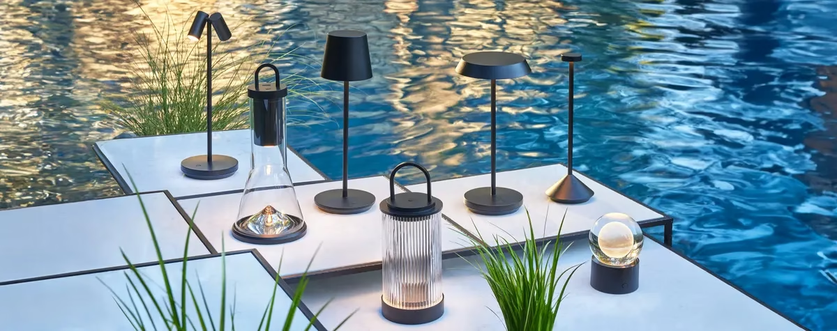
Interior design in 2026 is being redefined by a decisive shift away from sterile minimalism toward layered, expressive, and emotionally resonant spaces. While muted tones still anchor many interiors, bold color palettes are increasingly being used to inject personality, depth, and visual storytelling into homes. Designers are prioritizing contrast, saturation, and intentional color layering, resulting in spaces that feel curated rather than purely decorative.
Recent reports confirm that earthy tones, vibrant accents, and nostalgic hues are dominating palettes this year, often combined in unexpected ways to create balance and energy. Meanwhile, trend forecasters highlight the growing popularity of chartreuse, plum, teal, and burnt caramel as standout shades shaping interiors.
In addition, current design narratives emphasize warmth, individuality, and emotional connection, signaling a departure from cool-toned neutrals and overly uniform aesthetics.
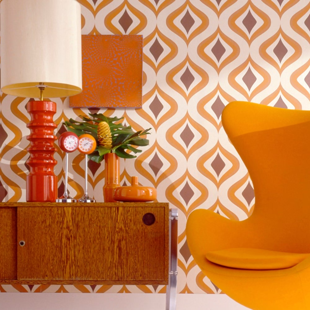
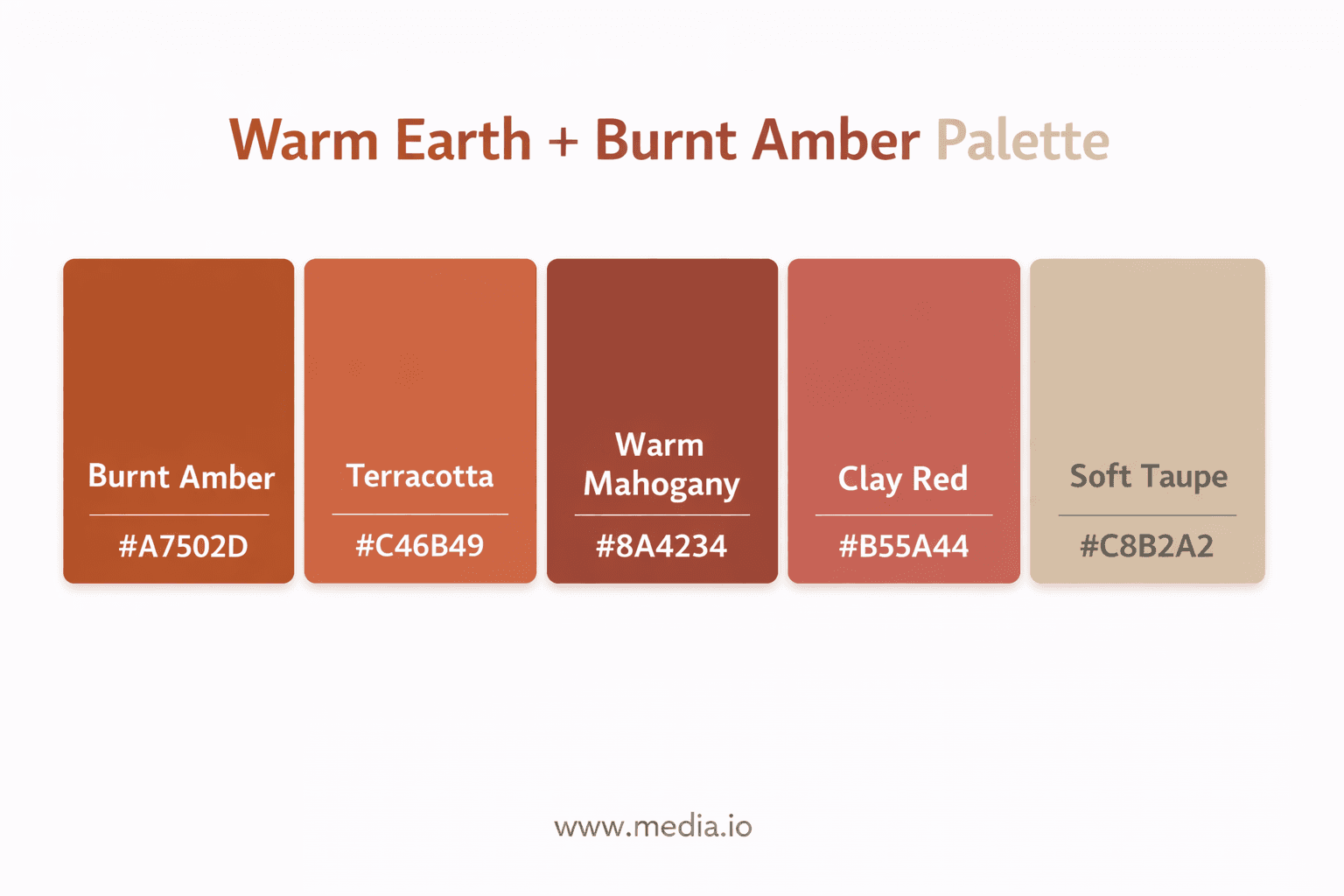
1. Warm Earth + Burnt Amber Palette
A grounded yet luxurious foundation
This palette is anchored in natural warmth, combining desert-inspired hues with deep, resinous tones. The rise of colors like warm mahogany and burnt umber reflects a desire for grounding interiors that feel both timeless and contemporary.
This approach works effectively because it introduces depth into a space without overwhelming the senses, allowing for a balanced and visually appealing environment. At the same time, it pairs seamlessly with natural materials such as wood, leather, and stone, creating a cohesive and grounded aesthetic. Moreover, it enhances natural lighting conditions, helping light interact more dynamically with surfaces and textures to produce a warmer and more inviting atmosphere.
This approach is best used in living rooms, where it can establish a welcoming and cohesive atmosphere, as well as in dining spaces, where it enhances the overall ambiance and elevates the dining experience. It is also particularly effective for feature walls, where it can serve as a focal point, adding visual interest and depth without overwhelming the surrounding design.
2. Chartreuse + Plum Contrast Palette
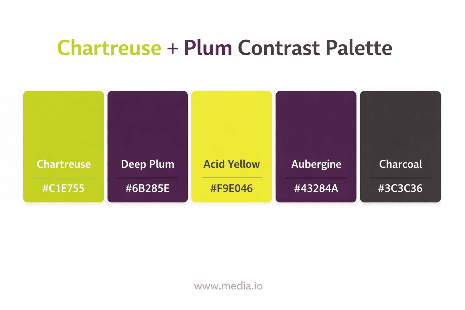
Bold, high-energy, and fashion-forward
This palette is one of the most unexpected yet impactful combinations of 2026. Inspired by fashion and digital aesthetics, it embraces contrast as a central design principle.
This approach works because it creates instant visual drama, immediately drawing attention and establishing a strong design statement within a space. At the same time, it reflects a contemporary and experimental design sensibility, making it especially relevant for modern interiors. Additionally, it achieves a careful balance between brightness and depth, ensuring that bold elements remain visually striking without feeling overwhelming or unrefined.
This approach is best used in accent walls, where it can serve as a striking focal point, as well as in statement furniture, where it enhances the visual impact of key pieces within a space. It is also particularly well-suited for creative studios, where a bold and expressive environment can help inspire innovation and artistic thinking.
3. Apple Green + Coral Fusion
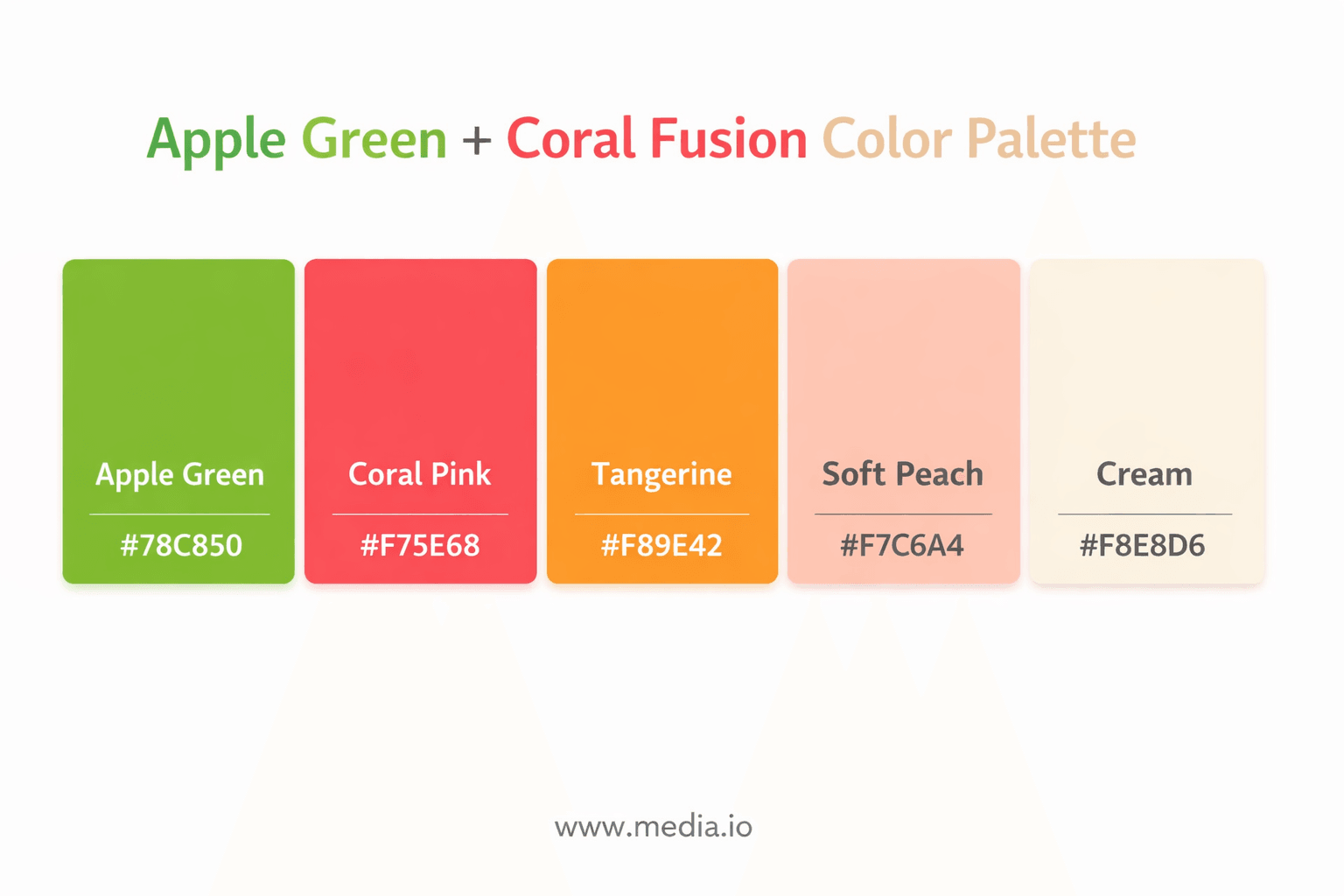
The “joyful interiors” palette
This palette embodies the rise of feel-good interiors, with apple green emerging as a standout color for 2026 due to its energizing qualities.
This approach works because it enhances mood and vibrancy, bringing a lively and engaging atmosphere into a space. It also introduces a sense of playful energy, making interiors feel more dynamic and expressive. At the same time, its versatility allows it to suit both modern and retro styles, seamlessly bridging different design aesthetics while maintaining a cohesive and appealing look.
This approach is best used in kitchens, where it can energize the space and make it feel more inviting, as well as in kids’ rooms, where it supports a lively and imaginative environment. It is also particularly effective in social spaces, where a vibrant and engaging atmosphere can encourage interaction and create a more enjoyable setting for gatherings.
4. Teal + Burnt Caramel Palette
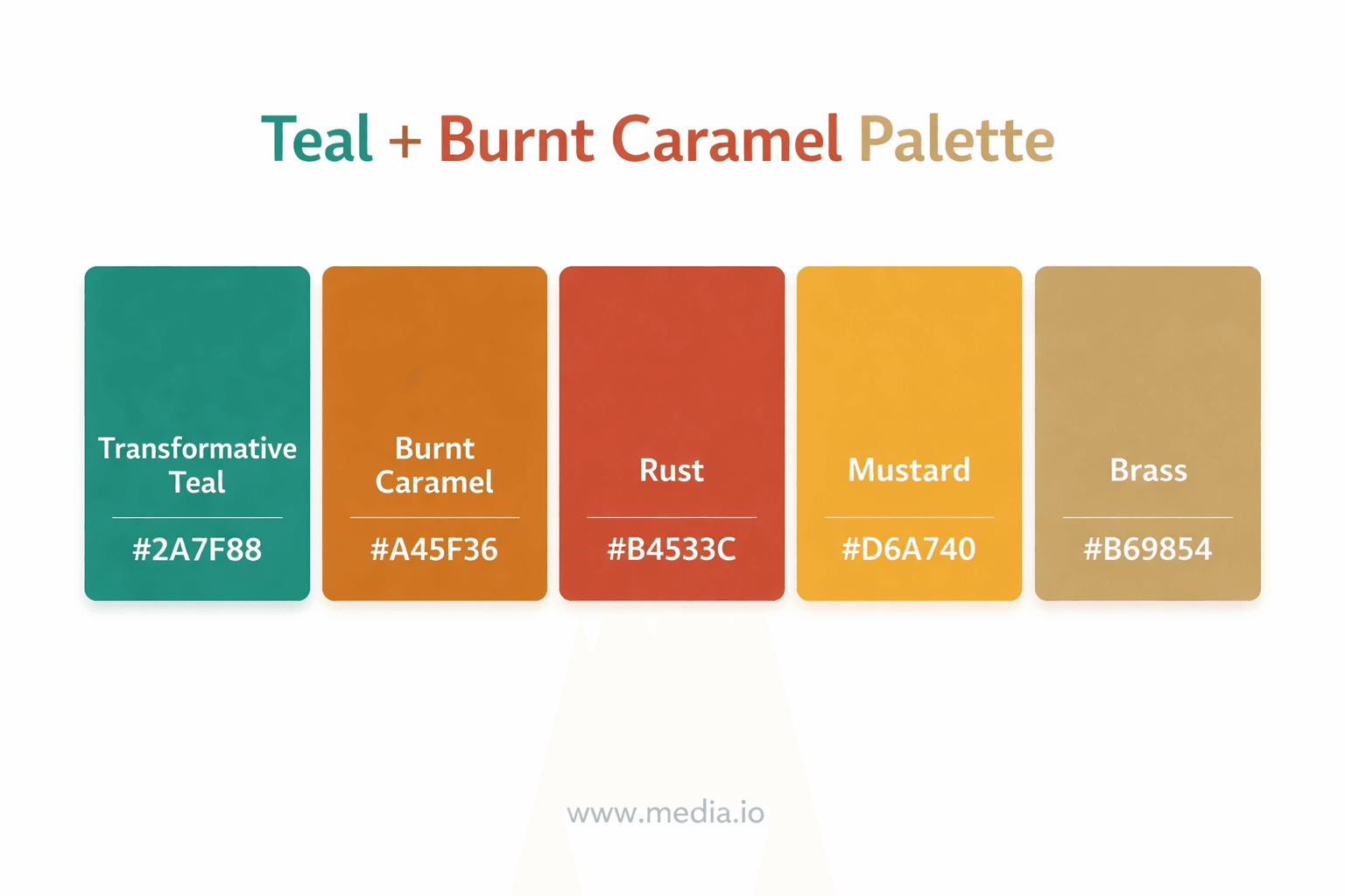
Sophisticated and moody with a modern edge
Teal remains a dominant color in 2026, especially when paired with warm, caramel-like tones that soften its intensity.
This approach works because it effectively balances cool and warm tones, creating a harmonious and visually appealing environment. It also adds a sense of richness and elegance, elevating the overall aesthetic of a space. Moreover, its versatility allows it to perform well in both bright and dim settings, maintaining depth and character regardless of lighting conditions.
This approach is best used in bedrooms, where it can create a calm and refined atmosphere, as well as in libraries, where it enhances a sense of depth and quiet sophistication. It is also highly effective in offices, where a balanced and elegant environment can support focus, productivity, and a polished professional aesthetic.
5. Dusty Rose + Chocolate Brown Palette
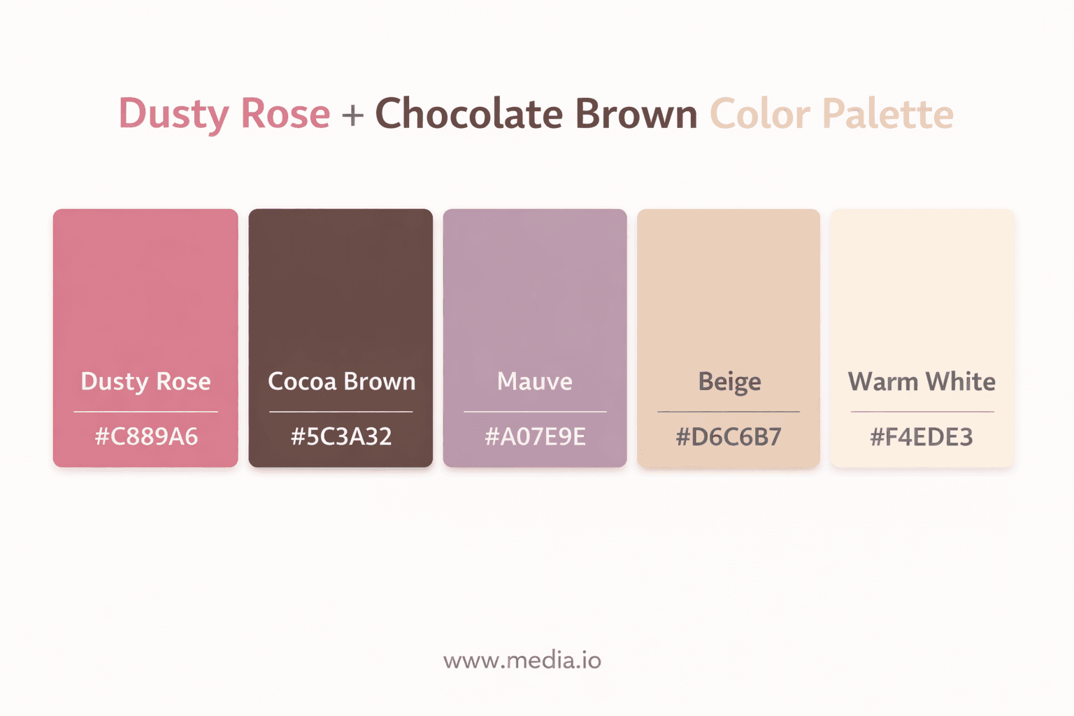
Soft yet grounded elegance
Designers are replacing stark contrasts with muted yet rich combinations, and this palette exemplifies that transition.
This approach works because it feels calming yet sophisticated, creating a balanced atmosphere that is both relaxing and refined. It adds warmth to a space without introducing visual heaviness, allowing the design to remain light and inviting. At the same time, its high versatility makes it adaptable across different styles and settings, ensuring it integrates seamlessly into a wide range of interiors.
This approach is best used in bedrooms, where it can foster a calming and intimate atmosphere, as well as in lounges, where it enhances comfort and relaxed sophistication. It is also particularly well-suited for boutique-style interiors, where its refined and versatile character helps create a curated, design-forward aesthetic.
6. Mediterranean Blue + Sand Palette
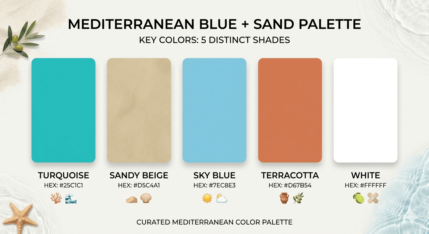
Inspired by the new Balearic aesthetic
This palette reflects the evolution of coastal design into something more vibrant and eclectic.
This approach works because it evokes a sense of travel and escapism, bringing a worldly and immersive quality into the space. It also balances brightness with neutrality, ensuring the design feels light and open while still grounded and cohesive. In addition, it integrates natural textures, which enhances tactility and reinforces an organic, well-layered aesthetic.
This approach is best used in living rooms, where it can create a relaxed yet inviting atmosphere for everyday living and entertaining. It is also well-suited for outdoor spaces, where it enhances a natural, open-air aesthetic that connects seamlessly with the environment. Additionally, it works particularly well in vacation homes, reinforcing a sense of escape and leisure that aligns with a more laid-back and restorative lifestyle.
7. Deep Forest + Moss Green Palette
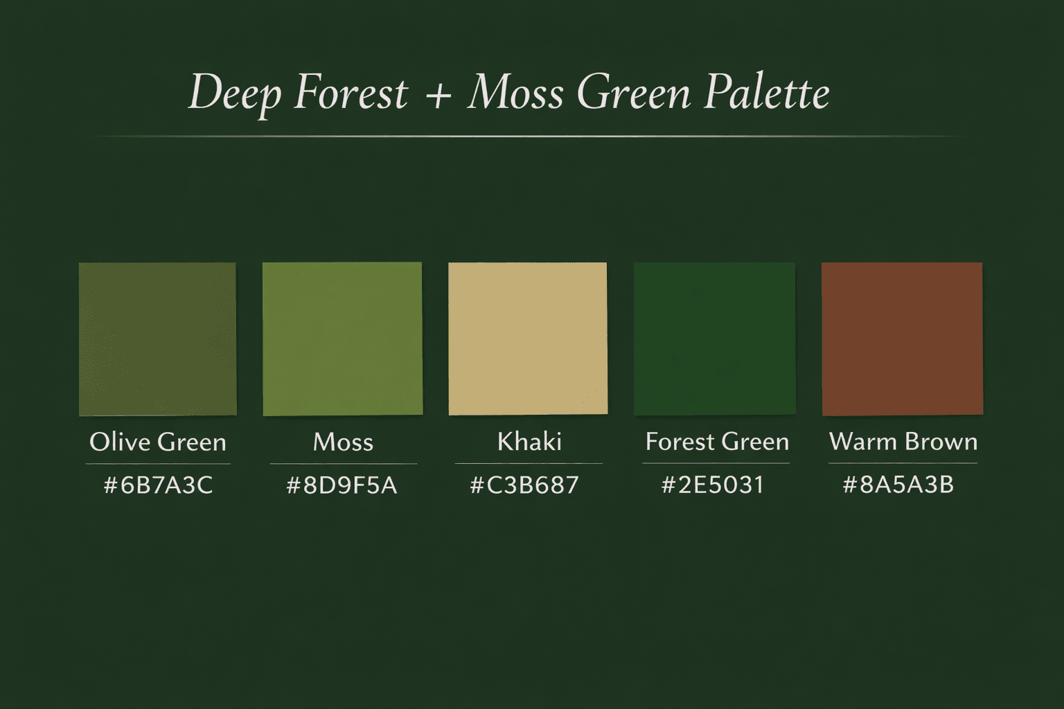
Nature-driven and restorative
Cool-toned greens are being replaced by earthier, richer variants, creating more grounded interiors.
This approach works because it promotes calm and relaxation, helping to create a soothing and restorative environment. It also strengthens the connection between interiors and nature, bringing a sense of the outdoors into the living space. In addition, it pairs well with organic materials, enhancing a cohesive, grounded aesthetic that feels natural and harmonious.
This approach is best used in bedrooms, where it can foster a restful and restorative atmosphere, as well as in bathrooms, where it enhances a sense of cleanliness and tranquility. It is also particularly effective in wellness spaces, where a calm and grounding environment is essential for relaxation, reflection, and overall well-being.
8. Primary Color Revival Palette
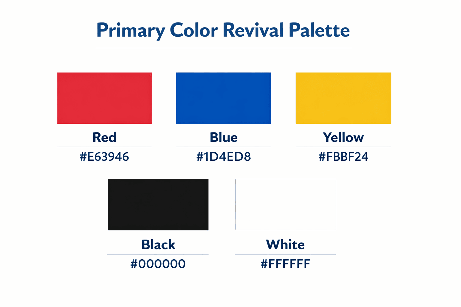
Playful yet structured
Primary colors are making a comeback but in more refined and curated applications.
This approach works because it creates visual clarity, allowing design elements to feel more structured and easy to interpret. It also references retro design, drawing on nostalgic aesthetics that add character and familiarity. In addition, it introduces a bold personality into the space, ensuring a distinctive and memorable visual impact.
This approach is best used in modern apartments, where it can enhance clean, contemporary interiors with added character and definition. It is also well-suited for creative workspaces, where a visually engaging environment can support inspiration and productivity. Additionally, it works effectively in accent décor, where it can introduce bold detail and elevate smaller design elements without overwhelming the overall space.
9. Monochrome Brown Spectrum
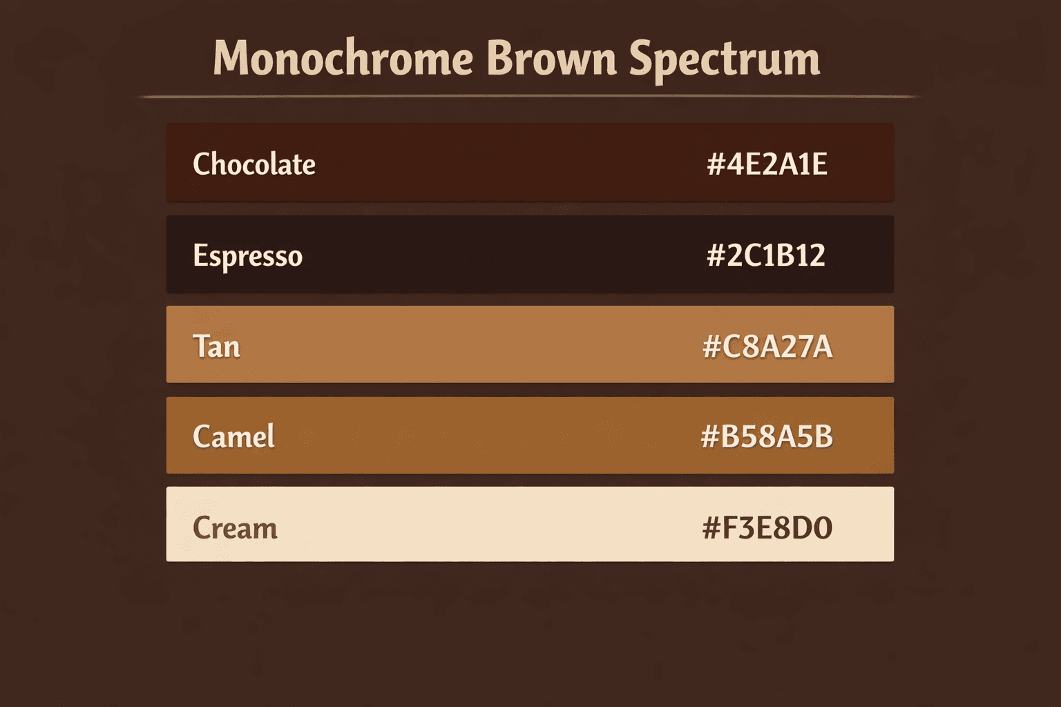
The new neutral evolution
Brown has re-emerged as a dominant neutral, replacing gray in many interiors.
This approach works because it adds depth and richness to a space, creating a layered and visually engaging aesthetic. It also feels timeless and luxurious, ensuring that the design remains elegant and relevant across changing styles. In addition, it complements nearly all accent colors, making it highly adaptable and easy to integrate into a wide range of interior palettes.
This approach is best used in living rooms, where it can enhance depth and create a refined, welcoming atmosphere, as well as in hallways, where it adds visual interest and continuity to transitional spaces. It is also highly effective in offices, where a timeless and polished aesthetic can support a professional, focused, and well-composed environment.
10. Multichrome + Metallic Accents
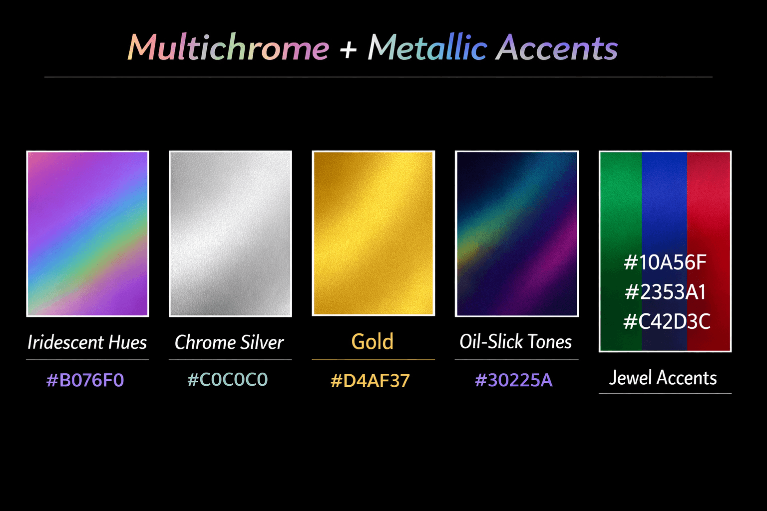
Futuristic and expressive
Key Colors:
- Iridescent hues
- Chrome silver
- Gold
- Oil-slick tones
- Jewel accents
This palette draws from both fashion and technology, incorporating reflective surfaces and shifting tones.
This approach works because it creates dynamic visual effects that add movement and interest to a space. It also enhances lighting by interacting with both natural and artificial sources, resulting in a more layered and visually engaging atmosphere. In addition, it feels modern and experimental, making it well-suited for contemporary interiors that embrace bold and innovative design expressions.
This approach is best used in feature installations, where it can serve as a focal point and elevate the overall design impact of a space. It is also well-suited for kitchens, where it adds a modern and expressive touch to an otherwise functional environment. Additionally, it works effectively in statement décor, where bold design elements can stand out and contribute to a distinctive and visually engaging interior aesthetic.
Conclusion
Ultimately, 2026 interiors are being shaped by a fusion of bold expression and grounded sophistication. While minimalism is not entirely disappearing, it is being reinterpreted through richer palettes, layered textures, and emotionally driven design choices.
Importantly, bold color palettes are no longer reserved for statement pieces—they are becoming foundational elements of interior design. Whether through earthy ambers, vibrant greens, or high-contrast combinations, color is being used as a primary storytelling tool within the home.
As a result, homeowners and designers alike are encouraged to move beyond safe choices and embrace palettes that reflect personality, culture, and experience—because in 2026, interiors are not just designed; they are deeply lived in.
Stay updated—click here for more trending HOME news.
![]()